Minecraft Style Guide
This set of guidelines covers the properties of the Minecraft art style. It is intended to help you create models and textures that fit right into the vanilla game and to unify the terminology for the community to give more efficient and constructive feedback. Please keep in mind that not all of the mentioned principles apply universally to non-vanilla art styles or to art unrelated to Minecraft. If you plan to create Minecraft art and aren't fully familiar with the technical aspects of it, reading Blockbench Overview & Tips is highly recommended. It contains materials on how to properly use Blockbench and take full advantage of its features.
Modeling
Element Count
Minecraft's art style is founded in simplicity. The overall shape of an object should be defined by the model and most of the detail by the texture. It should always be a goal to keep the element count as low as possible while still accurately depicting the object. However, simplifying shapes shouldn't go too far, to the point where they are no longer recognizable.
Shape Depiction
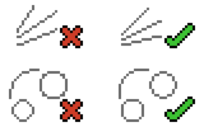
Therefore, depicting slants and curves as stairs needs to be avoided. Rotating an element to create a slant instead is preferable. Rotated elements can be found in many Minecraft models, but their use needs to be justified. For example, rotating elements next to each other in order to form a curve does not conform with the Minecraft aesthetic.
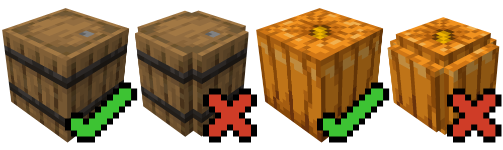
A spherical or cylindrical object would be translated into a single element. Examples of this principle can be found throughout the game (barrel, cake, log, grindstone, pumpkin, melon, cocoa pod...).
Minecraft models utilize planes (elements with only 2 faces) and transparency, often together. Small parts of an object can be depicted by a single large element with certain pixels strategically being fully transparent. In the Minecraft art style, this solution is preferable to using many small elements to depict the same object/parts of an object.
UV Mapping
The UV map defines how a texture is applied to the model. In Minecraft, a pixel on the texture corresponds to a pixel on the model (1 unit of scale in Blockbench). It is very important that the ratio of pixels is preserved on the model as well, i.e. that the texture does not get squashed or stretched.
In per-face UV mapping, Blockbench offers the Auto UV feature, which correctly scales the mapping of a face.
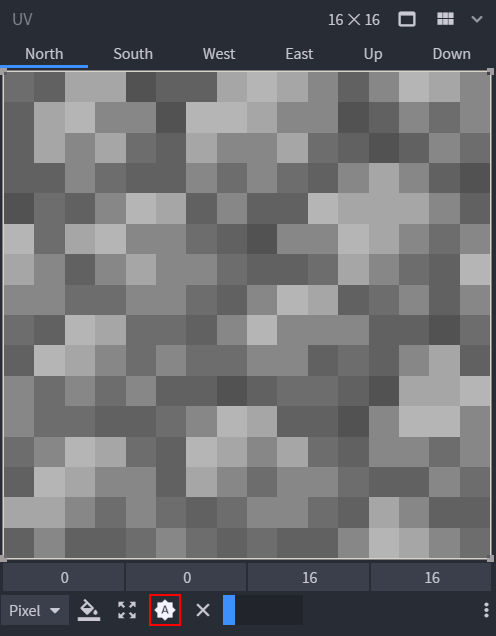
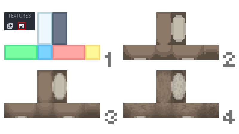
In box UV mapping, the map of the elements is unwrapped automatically and works for all faces by default. In the image below, you can see an example of an unwrapped UV map (blue = north, yellow = south, pink = west, green = east, white = top, grey = bottom). North is normally in the front (e.g. that is where the face of a character or the door of a closet would be).
Mixels
Much like pixels are picture elements (pix + el), mixels are elements of mixed resolutions, be it 2D or 3D. Most low-spec art (digitally restrictive art) avoids mixels altogether. Minecraft art, generally speaking, does not allow mixels (with the notable exception of slightly inflated elements on some models). Mixels on models are manifested as elements smaller than 1px (or 1 unit of scale in Blockbench) or overly inflated elements.
Size & Proportions
The dimensions of a Minecraft block are 16x16x16 pixels, which represents 1m³, meaning that a single pixel is 6.25cm long. This ratio should be taken into account, but it does not always apply. Small objects being recognizable takes priority over being to scale (e.g. a bee would have to be smaller than 1px if it were perfectly proportionate).
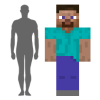
Furthermore, functionality within the game's own proportions may not translate directly from real life. The most important example of this is the player model. It is significantly bulkier than a regular human, so objects that the player interacts with should be created with this in mind.
Like with any art form, changing the proportions of certain parts of the model influences the way the user interprets what is being depicted and its function. For example, a large head on a small body can make the character cute, while an exaggerated torso and arms indicate strength.
Texturing
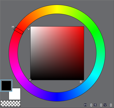
HSV
Hue is the color family determined by wavelength (e.g. brown falls into red or orange, aquamarine falls into blue etc.). It can be thought of as a point in the spectrum of the rainbow. Its range is 0°-360° (rainbow wrapped in a circle).
Saturation is the color intensity, i.e. the presence of a given hue. The higher the saturation, the stronger the hue. Its range is 0-100 (on the horizontal axis).
Value is the brightness of the color. A higher value means a brighter color. Its range is 0-100 (on the vertical axis).
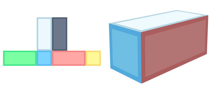
Color Ramps & Palettes
A color ramp is a lineup of all shades of a single color according to brightness. A color palette is the set of all color ramps used in a texture file. It is best to start the creation of a ramp with the midtone. From there, it is advisable to only create one shadow and one highlight and apply basic shading. Afterwards, more shades can be added.
Changing the hue, saturation and value between shades is called shifting (hue shifting, saturation shifting, value shifting). It is important to keep the step between shades balanced.
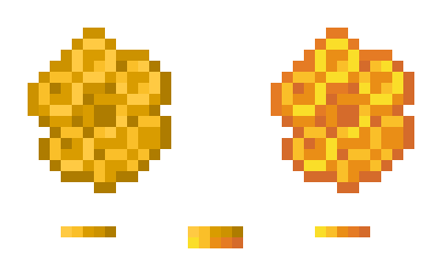
A straight ramp is a color ramp all of whose shades are only different in their value (brightness). Straight ramps are very easy to create and often aren’t used due to their dull look, but they can be suitable for some materials and colors. In the image below, the straight ramp is on the left and the hue-shifted ramp is on the right.
Shading
In pixel art and, therefore, in Minecraft art, placing pixels needs to be deliberate. In order to achieve this, the use of purposefully restricted palettes and a set of tools without smoothness (pencil, shape tool, fill bucket and eraser) are necessary. The material properties need to be clearly defined.
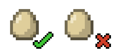
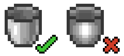
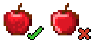
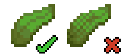
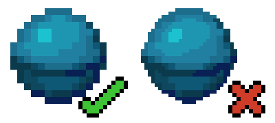
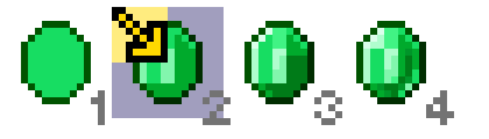
Anti-aliasing or AA is a method of manually smoothing out the transition between shapes by placing differently colored pixels on the border. The egg on the left contains AA, the one on the right doesn't.
Dithering is a method of transitioning between two pixel clusters by intersecting their pixels in a certain pattern. Checkered dithering is the most common type.
Using a brush can produce a noisy texture. Noise adds no information to the texture and, in the worst case, makes it unrecognizable without context.
There are many possible ways for shading to go in the wrong direction, often by accident. Banding, in the broadest sense, is an artifact of pixels that line up in a sequence from brightest to darkest, whether in straight lines (a.k.a. fat lines or fat pixels), diagonal lines (a.k.a. staircase banding) or in corners (a.k.a. hugging). The reason it needs to be avoided is that it reveals the pixel grid, distracts the eye of the viewer and the shape is misrepresented. Banding usually appears when the artist tries to create anti-aliasing or has a hard time distributing the shades over a surface.
Pillow shading is an artifact similar to banding, where the artist applies shades concentrically from darkest to brightest in an attempt to somehow cover the surface.
Pancake shading is an artifact of placing the highlights on one side and shadows on the opposite side of a surface. It disregards the shape of the surface.
Unnecessary dithering comes in different forms, the most basic of which is the overuse of dithering where the transition starts, covering too much surface area. Other cases are when there is no need for dithering at all or when it’s used inconsistently (randomly, only in some places) within the texture.
Mixels on the texture can only occur if the artist purposefully scales up their texture and proceeds to draw on it. This is usually done in order to add more detail. If there is no space for additional detail in the 16x16 resolution, either the entire texture needs to be reevaluated or the detail is not necessary. Elements of conflicting resolutions make a texture seem off-balance and less appealing. It usually looks as though it was scaled up or down wrong.
Lines & Shapes
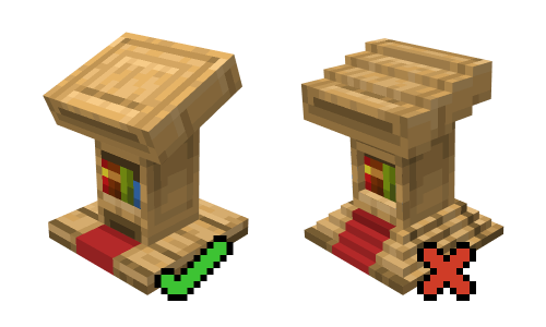
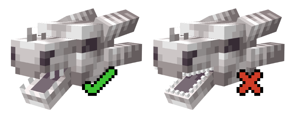
Jaggies are shapes (unintentional corners) in pixel art that appear due to lines/edges being unpolished or lacking anti-aliasing. Straight lines need to have a consistent step so that they wouldn't look unpolished. This has to do with the geometric properties of diagonals. Curves can also contain jaggies, usually visible as corners or diagonal lines (meant to represent round shapes).
Item Textures
All drawn items fit within a 16x16 grid.
- Start by drawing the shape of the item using a midtone. Give it a significantly darker outline.
- Add a highlight and a shadow. Item textures are shaded with the light source imagined as coming from the top left corner. Shade the outline accordingly.
- Add the rest of the palette (more highlights and shadows).
- Add in surface properties. In this example, the item is translucent and smooth. In other cases, the properties could be roughness, cracks, folds, dirtiness...
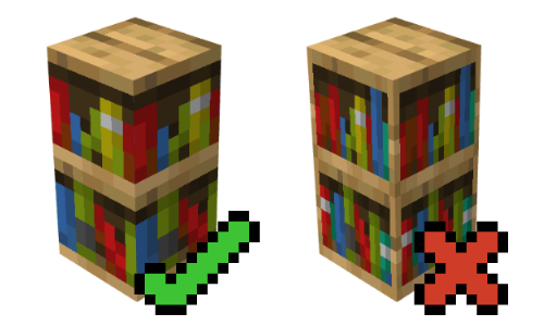
Block Textures
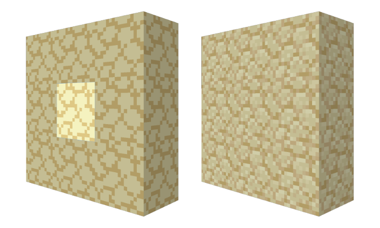
Block textures need to look good on their own, as well as when placed next to each other. Placing several blocks of the same kind next to each other is called tiling. If a portion of the texture visibly repeats, revealing the tiling pattern, it is called a tiling artifact and is to be corrected.
Blockbench can be used to make the block texture directly (in Paint mode) or just as a live 3D preview of a texture created in an external image editor. The best way to preview tiling is by creating a wall of 3x3 blocks.
It is important to check tiling before doing too much shading. An early version of the texture with two or three shades is enough. After checking for tiling, you can proceed with shading, but still regularly check for tiling as you shade.
Entity Textures
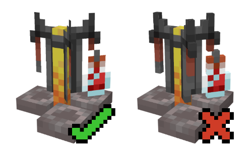
Entity textures use box UV mapping and follow a special set of texturing guidelines. The top and front of the entity need to be brighter than the bottom and back. This applies to shading the faces individually, as well as how the faces are shaded relative to each other (e.g. the top face will be noticeably brighter than the bottom face).
- Generate a texture template to make the texturing process easier. Blockbench automatically maps the elements too.
- Sketch the color distribution, add a shadow and a highlight.
- Add more shades to the palette.
- Define the material by editing the relative position of clusters of certain shades. Get rid of banding and any other shading artifacts from the previous steps.